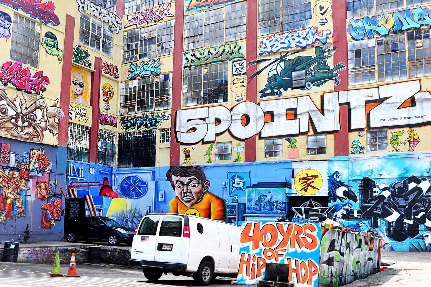
Urban Art: The different techniques and styles of Graffiti
Sarah Guilbaud • Posted on May 15, 2024
Tags, throw ups, masterpieces, 3D… There are multiple techniques and terms specific to the world of Graffiti Art. Here is a brief overview of the language codes and styles that are most the representative of this art, which was once only for the initiated.
The tag
A must for all graffiti artists, the “tag” is the starting point of the Graffiti movement. A real signature made up of stylized letters that form a name (the pseudonym of the artist or his crew), the tag is made at full speed, usually using a single color, and can be small or large depending on the material used. Tags were initially done using felt pens, markers and pencils and gradually evolved to include spray cans, paintbrushes and other rollers, like the ones used for the Pixação in Brazil. In São-Paulo too, the alphabet has been distorted and the use of rollers has made it possible to reach heights that were inaccessible. Tags are massively shown to the greatest number of people using this technique, whereas the tag done with markers or with spray cans is worked on in a more calligraphic and stylized way. Some tags are sometimes barely readable and need to be decoded, read and deciphered by the more initiated. Taggers, as they are usually called, never stop competing, inventing new forms, playing with letters, distorting them, stretching them to offer a language that has evolved over the decades and which continues to surprise us.

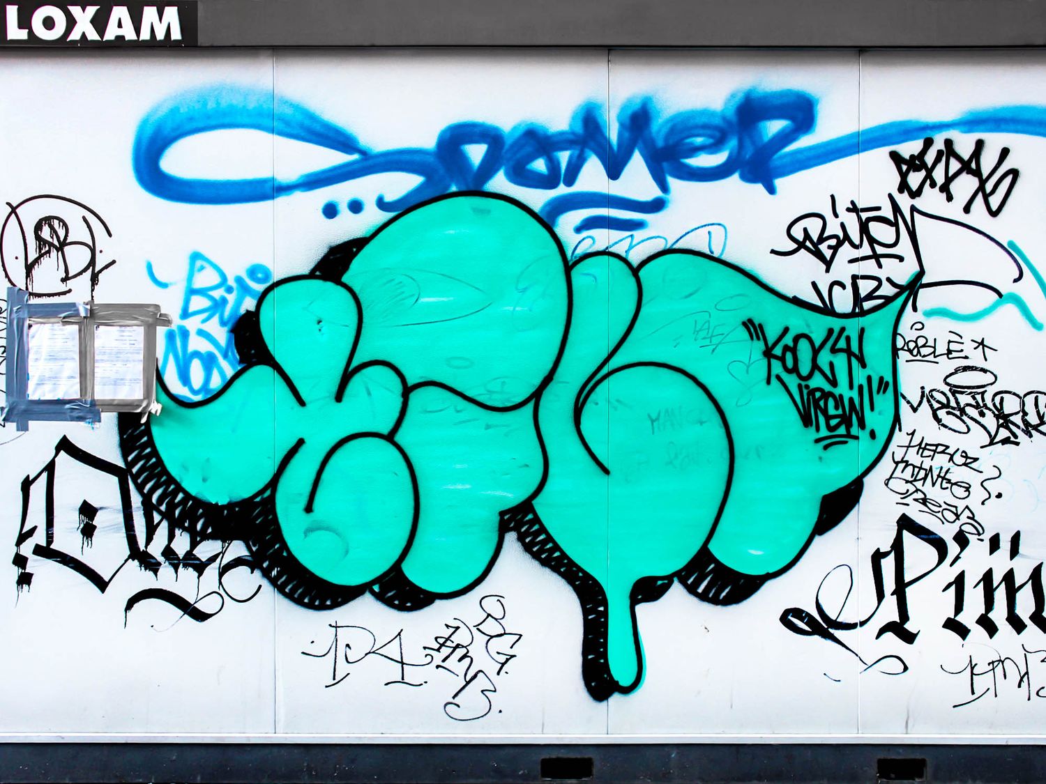
The throw up or flop
Thought of as a more sophisticated version of the tag and much more visible, the “throw up” or “flop” is a form of lettering executed just as quickly, but which takes the name of the graffiti artist (or "writer") and enlarges it. The goal is to become known with a more impressive style because the letters are larger. The tagger usually uses two colors, one for filling the letters and the other one for the outline. The letter is transformed by adding volume, often achieved through a style known as “bubble”. This style ultimately positions itself between the tag and the piece since it can be created in a few minutes on a truck, a metal shutter of a shop or simply a wall, while still having the same impact as a graffiti piece. This style is generally attributed to the New York graffiti artists of the early days who competed ingeniously in the 1970s using this technique to obtain the honorary title of "All City King", which means the most visible graffiti artist across the city, and which bring a strong recognition to the artist among his peers.
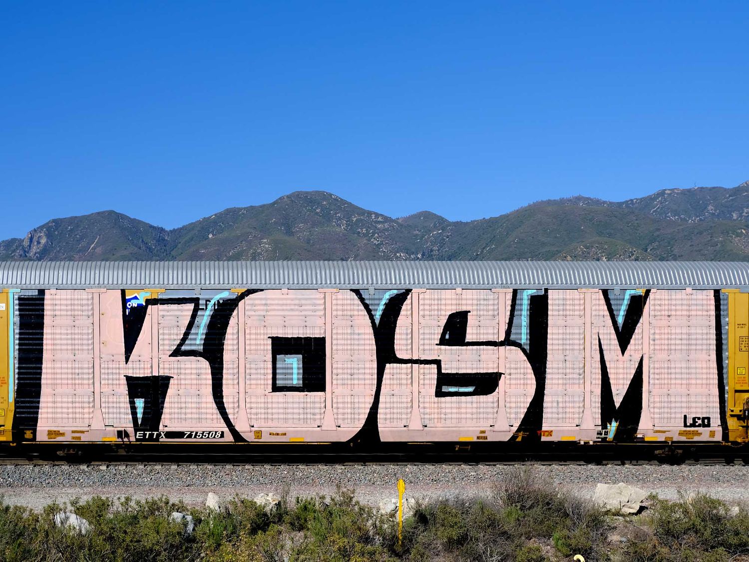
The block letter or blockbuster
In the same vein as the throw up, but with even greater visibility, it is obvious to mention the “block letter” technique, also known as “blockbuster”, which is characterized by a composition of massive block letters, usually done in two colors to stand out even more. The use of squares and rectangles for a block letter allows a compact and readable lettering by all, which is often made on a very large scale. Since the aim is to quickly cover large surfaces and reach hard-to-reach areas, such as rooftops or walls along railways, they are often done with rollers for a faster result. Without having a complex design, block letters have the specificity that they can be seen from a distance, which is why they are placed near highways and railway lines for maximum impact on the largest number of people. Some can even convey a strong message depending on where they are placed. And if the graffiti artist covers an entire train carriage, we then talk about a "whole car", and a "whole train" if it's an entire train!
The piece and the masterpiece
Unlike throw ups and blockbusters, the "piece" and the "masterpiece" are much more complex and sophisticated sets of letters, sometimes accompanied by additional graphic elements. These are large-scale murals that can take up the entire surface of a wall and therefore take a longer time to complete than a tag or a flop. As such, it is an opportunity for graffiti artists to further develop their technique by using different shapes and colors, while enjoying organizing "jams" to share this moment with other graffiti artists. That's why these are generally done in vacant lots away from prying eyes, authorized locations, or during festivals and public commissions to get time to paint. These huge mural artworks, which can take the form of outstanding XXL masterpieces, also allow artists to gain recognition from their peers thanks to their mastery of spray painting, and it's undeniable that they have also paved the way for mural commissions.
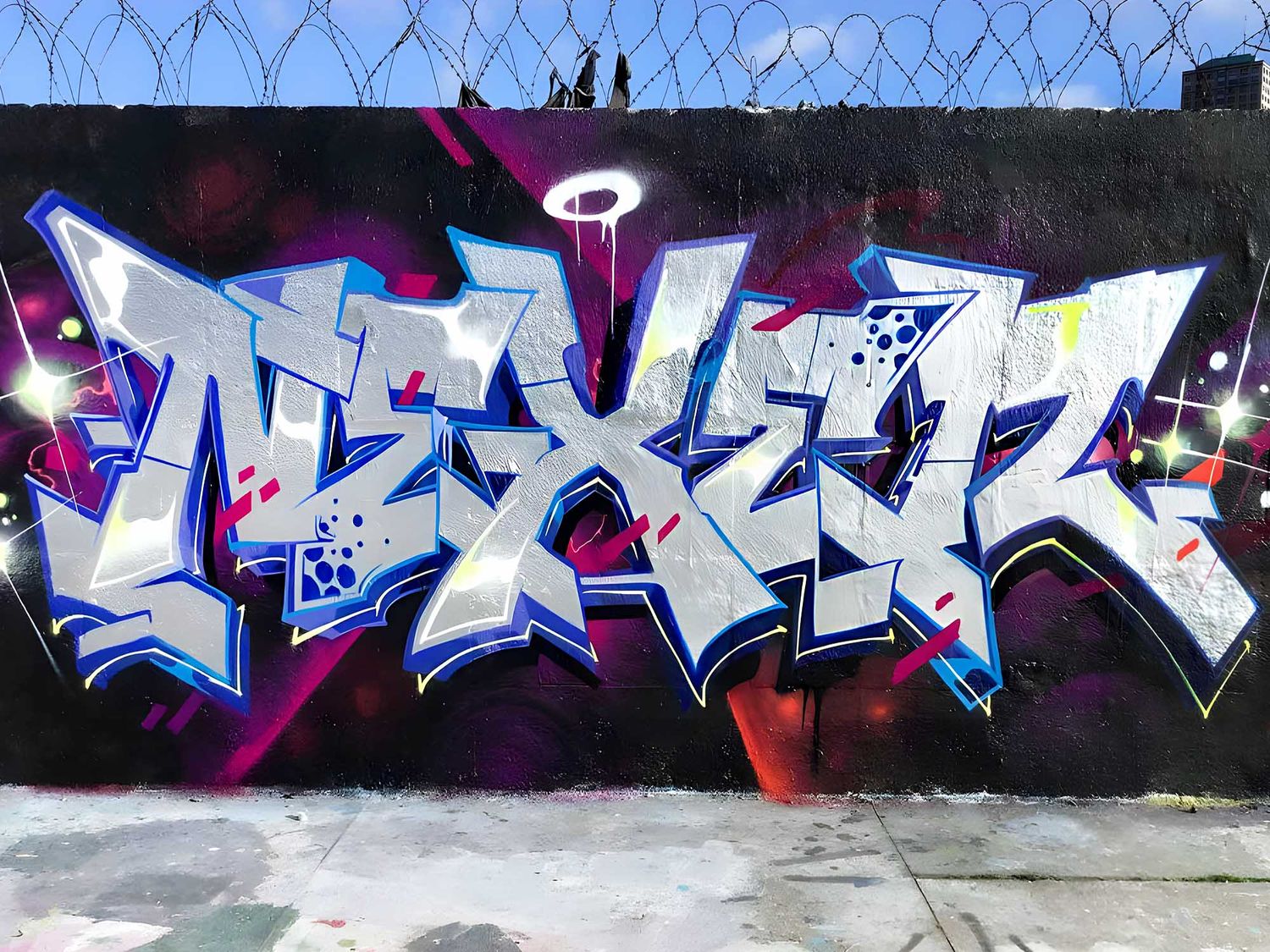
The wildstyle and semi-wildstyle
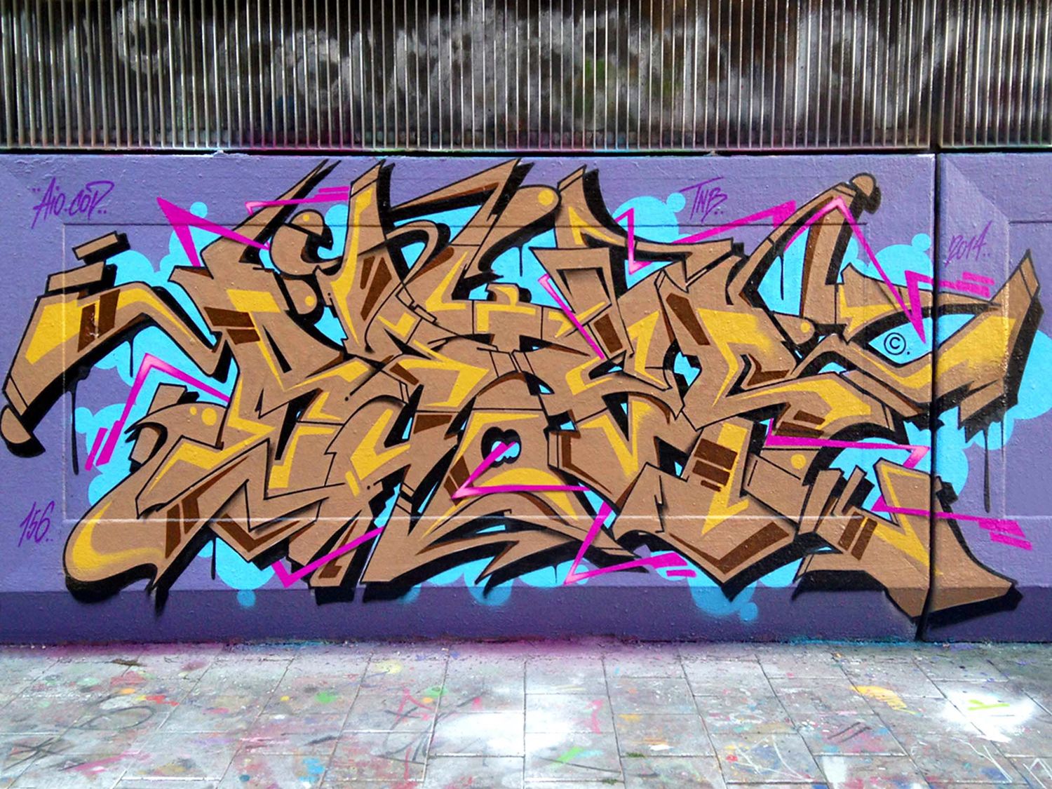
Among the different styles displayed in large format, one of the most iconic is undoubtedly the "Wildstyle" which emerged in the 1970s-1980s in New York and has become increasingly complex over time in Europe. Here, tapering letters intertwine with each other, and numerous graphic elements are incorporated into the composition according to the effect desired by the graffiti artist, such as arrows, points, serifs, and shadow effects. As a result, this compact composition becomes almost unreadable, and it is very difficult to identify the letters that make it up. This wild style is therefore complicated to read for the uninitiated due to its numerous depth and thickness effects, but it should not be confused with the 3D style that emerged in the 1990s. Among the most representative artists of this bold and spectacular style are primarily the artist Tracy 168, who is considered its initiator, and Phase 2, but also more contemporary international artists such as Bates, Chips, Taste, Mist, Cren and Zurik.
The 3D style and anamorphosis
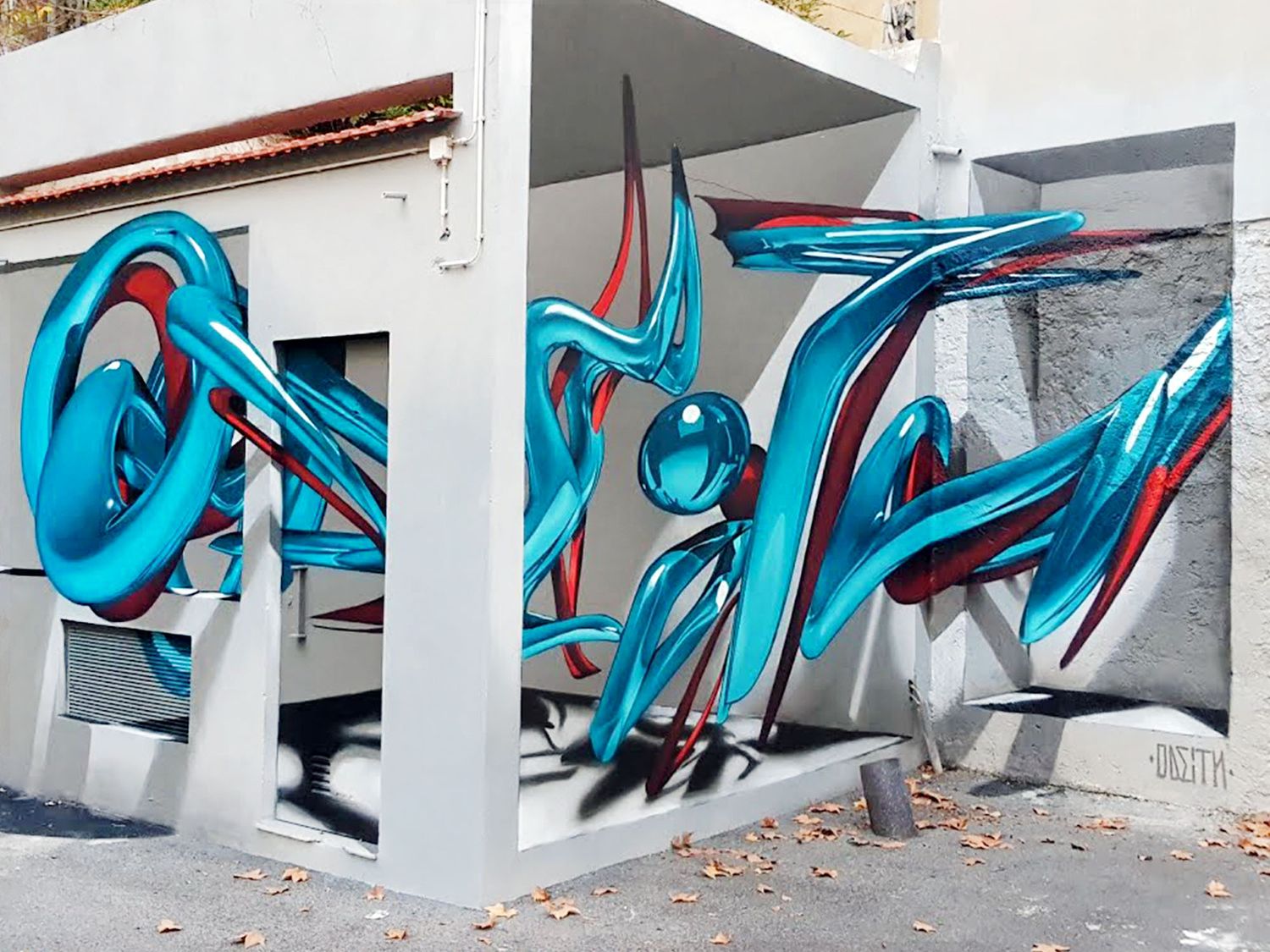
Although wildstyle involves elements of depth, it is nevertheless different from another major style in Graffiti, which is the "3D style." A genuine evolution of Graffiti developed by Erni Vales, 3D consists of integrating perspective into letters to give them a sense of volume and achieve an illusion of three-dimensionality in the end. Using different variations of colors for the background, outline, and filling of the letters, the artist's mastery then takes shape through the contrast between shadows and lights, giving the impression that the lettering is floating. Some artists have also pushed this practice to give rise to another style, that is called anamorphosis. This technique which can be used to create real trompe-l'oeil, literally allows mural to come to life as it gives the impression that the composition is emerging from the surface on which it is painted. The most striking artists of 3D Graffiti on the current graffiti scene are certainly Daim and Peeta, not to mention Odeith, Leon Keer, and Scaf for anamorphosis.
The cartoon style and characters
Particularly appropriate for those who practice drawing beforehand, the "cartoon" style refers to the creation of characters with spray paint. Whether directly inspired by cartoons and films from popular culture or created directly from the imagination of the artists, the characters bring life to the lettering. Many graffiti artists have thus taken the habit of integrating characters or even replacing one of the letters of their pseudonym with a character to bring a humorous touch to their work. Iconic characters like Puck and Cheech Wizard by the cartoonist Vaughn Bodé have been taken up by early New York artists and have greatly contributed to the development of this style. Other artists have also made it their specialty, either as a one-off on a wall or to accompany the creations of other artists more focused on working with letters, to bring scenography to their joint composition.
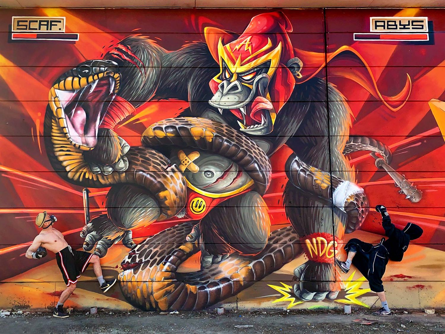
Over the decades, artists have developed various techniques, constantly renewed and sometimes pushed to extremes. For example, some artists even fill fire extinguishers with paint to create huge letterings, while others use acid to permanently affix their tags! The list of techniques and styles in the world of Graffiti is therefore rich and long. And we could also have mentioned the "Old School" style, which refers to the beginning of Graffiti, the "ignorant" style which breaks away from the usual criteria of precision in Graffiti, the "abstract" style which barely contains any letters, or the "realistic" style which is particularly suitable for trompe-l'oeil...